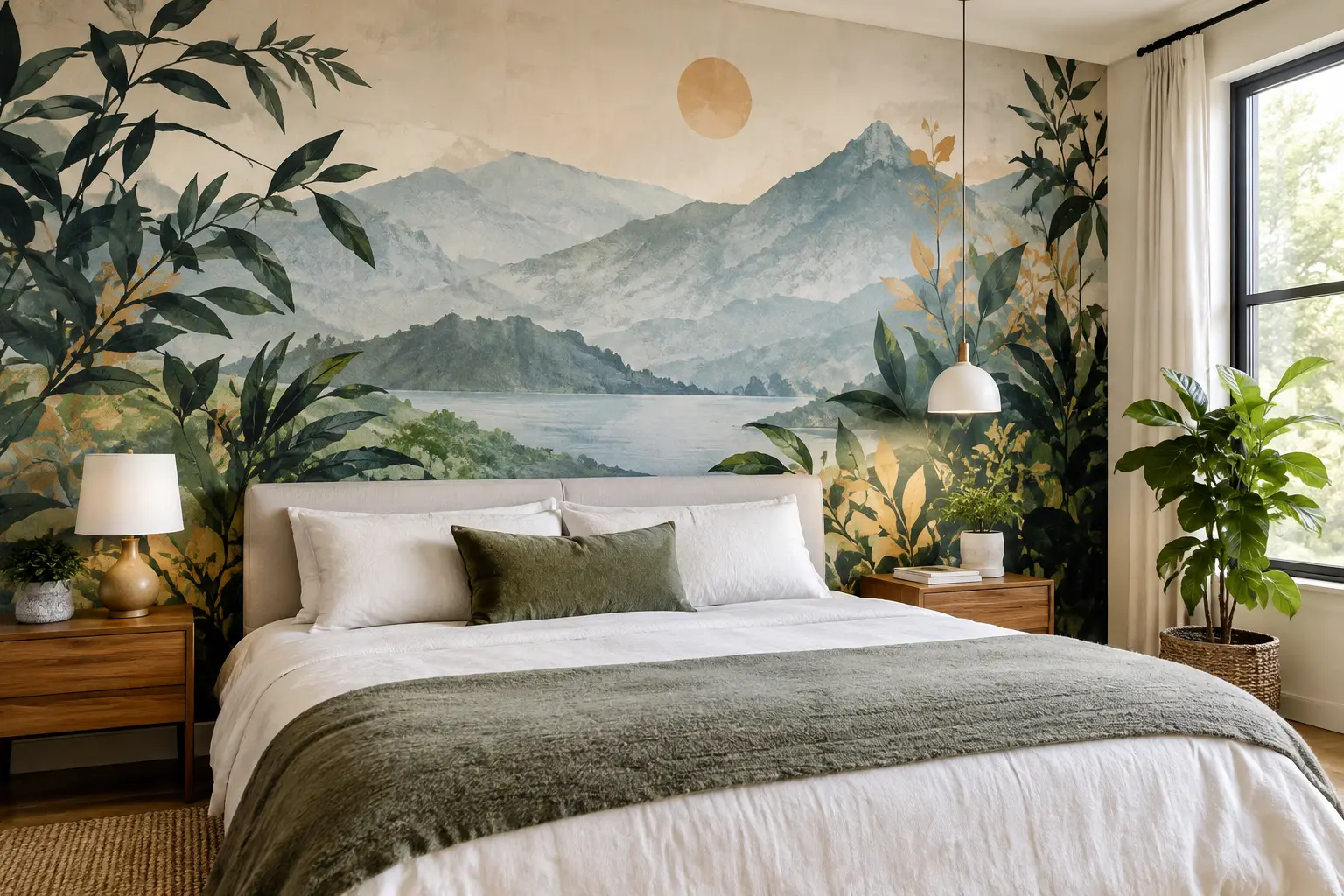
A single wall can now do more than supply a background color. The strongest mural trends are helping homeowners turn a bedroom into a retreat, give a nursery its own point of view, or make a home office feel intentionally separate from the rest of the house. The common thread is not simply choosing a bold image. It is choosing a visual that feels specific to the room, the people using it, and the scale of the wall.
For a mural to feel current for more than one season, it needs to work with the architecture and furnishings already in place. That may mean a quiet landscape behind a bed, an oversized floral in a dining room, or a custom photograph that brings a meaningful place into view every day. The best choices balance creative impact with practical details such as image resolution, wall measurements, lighting, and installation.
Mural Trends Moving Beyond Generic Accent Walls
Accent walls are not disappearing, but their role is changing. Instead of applying one contrasting paint color to a wall, more people are using wall murals to create depth, movement, and an identifiable mood. The wall becomes part of the room's design rather than an isolated decorative gesture.
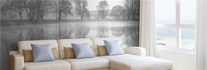
This shift favors images with atmosphere. Misty forests, soft beach horizons, architectural city scenes, and layered abstract patterns can make a compact room feel more expansive. In larger spaces, a mural can provide the visual weight that a collection of smaller framed pieces may not achieve. A full-wall print also avoids the cluttered look that comes from trying to build a focal point one accessory at a time.
There is a trade-off. Highly detailed images and strong contrast attract attention immediately, which is useful for an entryway, retail wall, or statement dining area. In a bedroom or meditation space, a lower-contrast image with room to breathe often feels more restful. Trend-driven does not have to mean visually loud.
Nature scenes with a quieter point of view
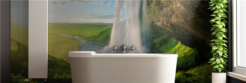
Botanical murals remain popular, but the look is moving away from uniformly bright tropical leaves. Current nature-led spaces often favor woodland paths, foggy pines, oversized wildflowers, desert textures, calm water, and close-up foliage with a more edited color palette. These designs bring in natural reference without requiring a room to become fully themed.
A forest mural in muted green and gray can support oak, walnut, black metal, or cream upholstery. A warm-toned field or beach scene may work especially well with linen, rattan, and light wood. The goal is not to match every item in the room. It is to establish a visual direction that makes the existing pieces look more considered.
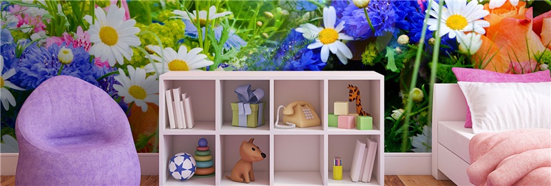
For children’s rooms, nature also offers more longevity than character-based décor. Animals, maps, mountains, and illustrated gardens can suit a child now without feeling too young a few years later. Position the mural where it can be appreciated from the bed or play area, while leaving storage walls and heavily used surfaces simpler.
Large-scale florals and expressive linework
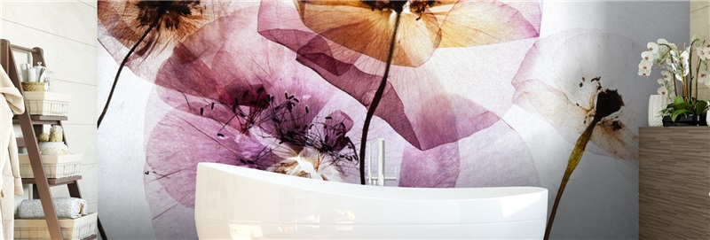
Florals are becoming more graphic and room-scale. Think enlarged peonies, sketch-like branches, vintage-inspired blooms, or loose watercolor petals rather than a small repeating pattern. Their size is what creates the effect: a bloom that spans several feet reads as art, not wallpaper.
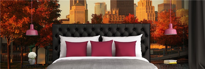
This approach is particularly effective behind a headboard, in a powder room, or along a dining wall. A detailed floral can soften straight-lined furniture and contemporary finishes, while monochrome linework can add personality without competing with colorful fabrics. If a room already has patterned curtains, rugs, and upholstery, choose a mural with fewer colors or a simpler composition so the wall does not fight for attention.
Custom Photography Is One of the Most Personal Mural Trends
The most lasting trend is the move toward images with personal meaning. A family travel photograph, a favorite mountain view, a coastal shot taken on vacation, or an original illustration can become a wall-sized feature that no catalog design can duplicate. This is especially compelling in living rooms, home offices, hospitality spaces, and client-facing commercial interiors that need a distinct identity.
Not every photo is ready for large-format printing. An image that looks clear on a phone may reveal blur, compression, or noise when enlarged to fill an eight-foot wall. File quality, pixel dimensions, subject placement, and cropping all matter. A photo with a wide composition and a sharp original file generally offers more flexibility than a tightly cropped social-media image.
Before printing, consider where doors, windows, outlets, and furniture will interrupt the image. A horizon line running behind a sofa can look intentional. A person’s face split by a light switch will not. For custom projects, design assistance and image review can prevent these problems before production. Murale Design, for example, evaluates supplied artwork and helps customers determine whether it is suitable for the finished mural size.
The return of place-based design
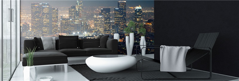
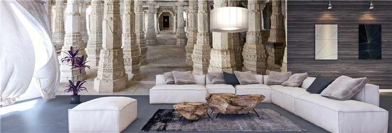
Place-based imagery is also growing in commercial and residential settings. City maps, neighborhood skylines, regional landscapes, and architectural photographs make spaces feel rooted rather than decorated from a distance. A map can give a study or office structure and visual interest. A black-and-white cityscape can sharpen a loft-style interior. A local landscape in a wellness space can create an immediate sense of calm and familiarity.
The key is choosing an image that has enough visual depth at room scale. A simple map with ample negative space often looks more refined than one packed with tiny labels. Similarly, an architectural image should have clear lines and a focal area that remains visible after furniture is placed in front of it.
Color Direction: Grounded Neutrals With Intentional Contrast
Many current mural palettes are more grounded than the high-saturation looks of recent years. Warm beige, clay, olive, smoky blue, charcoal, rust, and soft black are showing up in landscapes, abstracts, and murals with vintage character. These colors work well because they can connect to natural finishes and still create contrast against standard white or light-gray walls.
That does not mean bright murals are out. Cobalt, coral, sunny yellow, and vivid pink can make a strong impression in playrooms, creative studios, retail environments, and restaurants. The difference is intentionality. A bright mural works best when the rest of the room gives it space, with simpler furniture silhouettes and a more restrained supporting palette.
Lighting should guide color decisions. A mural on a wall with abundant daylight may appear cooler or less saturated at certain times of day. Warm artificial lighting can bring out cream, terracotta, and gold tones at night. Order decisions are easier when you look at the room's light, floor color, and largest furniture pieces together instead of evaluating the mural in isolation.
Abstract Murals for Flexible, Long-Term Style
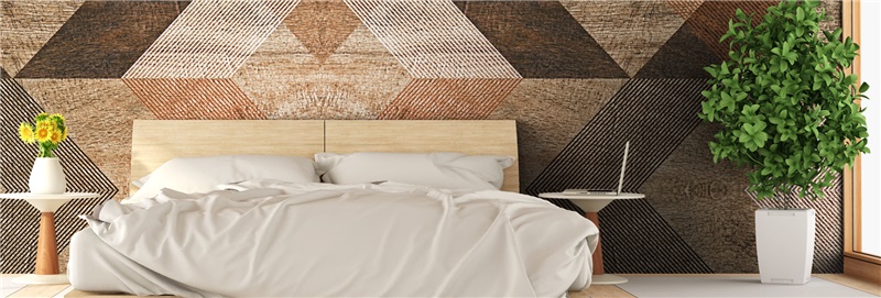
Abstract wall murals are a practical choice for homeowners who want a focal point without committing to a literal scene. Soft gradients, layered brushstrokes, stone-inspired textures, geometric shapes, and hand-drawn forms can create movement while leaving room for personal changes in furniture and accessories.
This flexibility makes abstract imagery especially useful in open-concept homes. A mural can define the dining zone or office area without constructing a physical divider. In rental-friendly situations where a dramatic transformation is wanted but future décor may change, an adaptable color-led design can offer more staying power than a highly specific motif.
Scale matters here. Small-scale geometric repeats can feel busy when enlarged across a wide wall. Conversely, a broad, airy composition may look underwhelming on a narrow section. View the design in relation to the actual wall dimensions, not just as a thumbnail on a screen.
How to Choose a Trend That Will Still Feel Right Later
A mural should respond to the room’s purpose before it responds to a trend report. Start by deciding what the wall needs to do. Does it need to make a room feel larger, create calm, introduce color, support a business brand, or give a plain space a memorable focal point? That answer narrows the visual direction quickly.
Next, measure carefully. Made-to-order wall coverings can be dimensionally customized, which is valuable when ceilings are not standard height or walls include unusual angles. Add extra material where recommended for trimming and account for obstructions before finalizing the artwork. A design may need repositioning so its strongest feature lands where it can be seen.
Material and preparation affect the final result as much as the image does. Adhesive vinyl mural panels are designed for painted drywall, but a clean, smooth, dry wall gives the adhesive the best surface to bond to. Fresh paint needs adequate curing time, and heavily textured or damaged walls may require preparation first. Durable latex inks and an anti-scratch finish help a mural stand up to daily life, but careful installation is still what makes panel seams and alignment look professional.
The most successful mural trends are not really about following the newest look. They are about giving a room a visual story that feels right when the furniture shifts, the season changes, and guests stop to ask where the wall came from.