
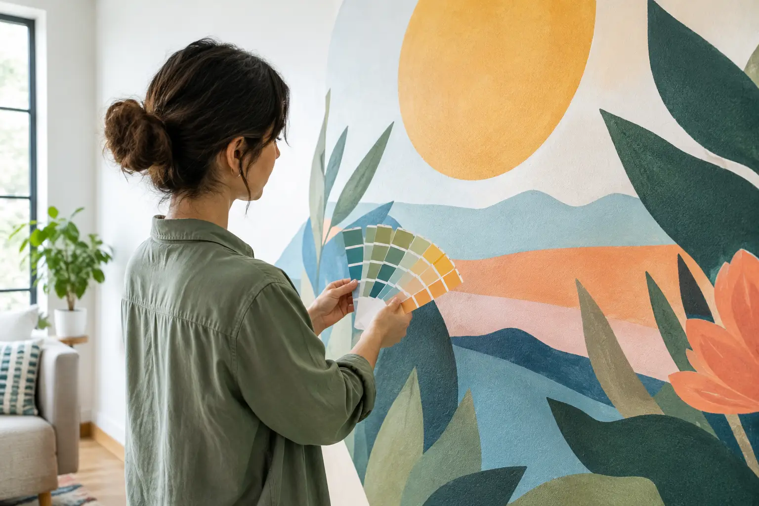
A deep navy mural can feel calm and tailored in a sunlit living room, then look almost charcoal after sunset. A soft blush floral may appear warmer beside cream trim than it did on a laptop. Mural color accuracy is not just about pressing print and hoping for a match. It is about managing the path from an image file to a large, finished wall in the lighting where you actually live or work.
For a room-scale feature wall, small color shifts are easier to notice than they are in a framed print. Understanding what influences the final result helps you choose artwork confidently, set realistic expectations, and create a mural that supports the rest of the room.
Why Mural Color Accuracy Is More Than a Screen Match
A screen creates color with light. Your phone, tablet, and monitor use red, green, and blue light to produce what you see, and each device can be set differently for brightness, contrast, warmth, and saturation. A wall mural is printed with inks on a physical surface. It reflects the light already present in the room.
That difference matters most with highly saturated blues, bright greens, deep reds, and very subtle neutral tones. An image that looks electric on a bright phone screen may print as a more grounded, realistic color. Likewise, a light beige that appears nearly white on one monitor can reveal a warm gray, sand, or pink undertone once it covers an entire wall.
This does not mean custom mural printing is unpredictable. It means the goal is faithful, well-managed reproduction rather than an impossible pixel-for-pixel screen match. Professional production accounts for the specific print process, ink set, material, and artwork. Still, the room itself gets the final say in how color is perceived.
Start With a Strong, Well-Prepared Image
The source file has the greatest influence on the finished mural. If an image is underexposed, heavily filtered, compressed, or edited on an uncalibrated screen, enlarging it will not correct those issues. In fact, a large format can make them more apparent.
For personal photos, use the original file whenever possible. Avoid screenshots, images pulled from social media, or copies that have been sent repeatedly through messaging apps. These versions often lose detail and may have automatic color adjustments applied. A high-resolution original gives the print team more information to work with, especially in skies, shadowed forests, skin tones, water, and softly shaded areas.
Editing style also matters. Many current photo filters deliberately mute highlights, push greens toward olive, add warmth to shadows, or increase contrast. Those choices can look striking on a small screen, but they may feel much stronger when the image becomes a 10-foot-wide focal point. Before ordering, ask yourself whether you want a dramatic edited look or the more natural colors of the original scene.
For a design from a mural catalog, the artwork has already been created with large-format presentation in mind. That can reduce uncertainty, particularly when you are choosing detailed botanical patterns, maps, watercolor scenes, or abstract artwork with carefully balanced colors.
Resolution and color work together
Resolution is usually discussed as a sharpness issue, but it also affects perceived color. When a low-quality image is enlarged, smooth transitions can break into visible bands or grain. A sunset may lose its soft gradient. A foggy landscape may look patchy instead of atmospheric. Strong source quality helps preserve both detail and the subtle tonal changes that make an image feel believable on a wall.
At Murale Design, image review is part of the custom-project process. A design team can evaluate whether a supplied image is suitable for the requested dimensions and flag concerns before production. That review is especially valuable when a cherished family photo, travel image, or client-provided brand artwork needs to become a large wall covering.
Consider the Room Before Choosing the Palette
The same mural can look notably different from one room to another. Natural daylight is often cooler in the morning and warmer later in the day. North-facing rooms may make colors feel cooler and more restrained, while direct afternoon sun can intensify warmth. Artificial lighting adds another layer.
Warm bulbs can make whites appear creamier and bring out yellow, tan, and red undertones. Cooler LEDs can make blue, gray, and crisp white elements feel more prominent. This is not a reason to avoid color. It is a reason to view your paint chips, flooring samples, fabrics, and furniture in the actual room at different times of day.
If your goal is a quiet bedroom, a misty forest, pale coastal view, or low-contrast abstract mural may provide the calm you want without competing with bedding and window treatments. In a retail space, restaurant, office lobby, or children’s room, stronger colors can create energy and clearer visual impact. Neither approach is automatically better. The best choice depends on how the room is used and what the mural needs to do.
Paint color deserves special attention. Adjacent walls can change how a mural is perceived through simultaneous contrast. A warm white paint may make a cool gray mural appear bluer. A dark green accent wall can make nearby leaf tones look brighter. When exact coordination is essential, such as in a commercial interior or a designer-led project, share the relevant paint, finish, and material information early in the planning process.
Know What Printing Can Reproduce Well
Modern latex printing produces rich, durable color suitable for interior wall décor, but every print method has a color range, often called a gamut. Some fluorescent, metallic, or extremely saturated screen colors fall outside the range that physical inks can reproduce exactly. The result is typically the closest achievable printed equivalent, not a failure of the mural itself.
This is most relevant for logos, branded environments, and artwork built around a precise signature hue. If a business depends on a specific brand color, it is wise to discuss that requirement before the design is finalized. A color that feels close enough for a home office may not meet the standard for a national retail rollout or a client-facing reception area.
Material also influences appearance. A matte or low-glare wall finish is often ideal for murals because it lets artwork read clearly without strong reflections from windows and lamps. The texture and base tone of the material can affect how light colors and fine details appear at close range. Durable adhesive vinyl with an anti-scratch finish is designed to provide a clean, practical surface, but it should still be selected and installed with the room’s lighting conditions in mind.
Practical Choices That Protect Color on the Wall
Good mural color accuracy continues after the artwork is approved. Install the mural on a properly prepared, smooth painted drywall surface so the design lies flat and cleanly. Uneven texture, patching compounds, stains, or a wall that has not fully cured can affect adhesion and the finished visual result.
During installation, align panels carefully so continuous artwork flows naturally across seams. This matters with horizons, architectural lines, large florals, and geometric designs, where even a small misalignment can draw attention away from the intended color and composition. Avoid judging the mural while it is still partially installed, curled, or surrounded by packaging. Step back once the wall is complete and view it from the normal distance used in the room.
After installation, give your eyes time to adjust. A mural changes the balance of an entire space, and a color that initially feels bold may become exactly right once furnishings, art, and lighting are back in place. If you are planning a major redesign, choose the mural early enough that you can coordinate textiles and paint around it instead of trying to force a last-minute match.
When Exact Color Matching Matters Most
Some projects need more planning than others. A personal landscape mural can tolerate slight differences between a screen and print because the overall mood is what matters. A hospitality project with branded accents, a retail wall with logo colors, or a designer specification that must coordinate with existing finishes calls for a more controlled conversation.
Share the intended wall dimensions, room photos, lighting details, and any color-critical references with the production team. Be clear about which element must match most closely. Is it the blue in a logo, the green in a fabric, the warm white of surrounding paint, or the overall feeling of the artwork? This helps prioritize the right adjustments and avoids treating every color in an image as equally critical.
The most successful mural projects balance creative vision with the realities of light, materials, and printing. Choose an image you love, view your room honestly, and bring color-sensitive questions forward before production. That is how a custom mural becomes more than a good file on a screen - it becomes a wall you are happy to see every day.
