
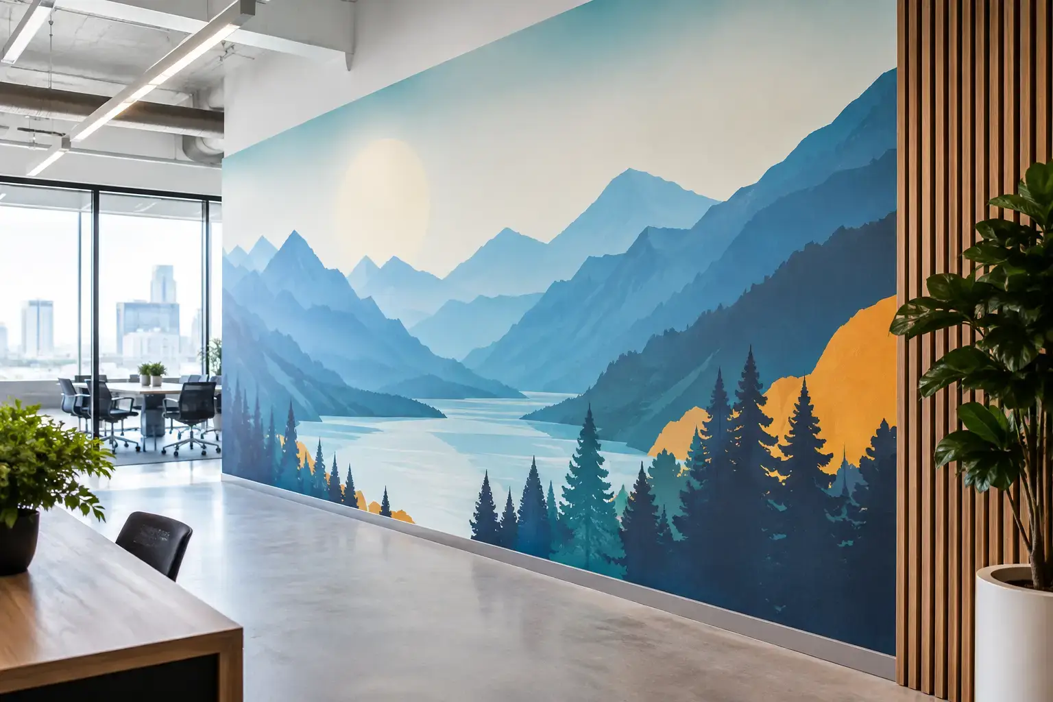
A blank wall at reception, behind a retail display, or along a conference room table is more than unused square footage. It is a highly visible opportunity to communicate what visitors should feel about your business. This commercial wall graphics guide will help you turn that opportunity into a well-planned installation - one that looks intentional up close, supports the function of the space, and holds up to daily use.
Commercial wall graphics work best when they are treated as part of the interior design plan, not as an oversized sign added at the end. The right image, finish, scale, and installation plan can make a compact office feel more established, give a wellness room a calmer atmosphere, or bring consistency to several customer-facing locations.
What Commercial Wall Graphics Need to Do
A successful wall graphic has a job. Sometimes that job is brand recognition: a logo, color palette, or visual story that makes the space immediately recognizable. In other settings, the goal is experiential. A forest scene may soften a clinical waiting area, while a cityscape or abstract pattern can give a modern lobby more energy.
Start by identifying the primary purpose before choosing artwork. For customer-facing spaces, consider the first impression from the entrance and how the wall will appear in photographs. For offices, think about employee experience, video-call backdrops, wayfinding, and the mood of shared areas. Retail teams should also consider sightlines to displays, merchandise colors, and seasonal changes.
The best choice is not always the loudest one. A bold custom mural can become a destination wall, but a more restrained texture, map, botanical design, or tonal pattern may serve a busy room better. It depends on how much visual activity already exists in the furnishings, flooring, signage, and lighting.
Match the Graphic to the Room's Pace
High-traffic areas benefit from visuals that remain appealing after repeated viewing. Reception areas, hotel corridors, restaurants, and retail stores often need a graphic with depth and a clear point of view, without so much fine detail that it feels chaotic at a distance.
Spaces intended for focus or restoration need a different approach. In meeting rooms, wellness studios, classrooms, and healthcare-adjacent interiors, natural landscapes, soft florals, gentle geometric patterns, and muted abstract designs can create presence without competing for attention. A child-focused business may call for brighter color and playful illustration, while a professional-services office may be better served by a refined landscape, architectural image, or custom brand pattern.
Choosing Artwork for Commercial Wall Graphics
There are two practical routes: choose a curated design or create a custom graphic from your own image files, brand assets, or commissioned artwork. A catalog design can simplify the process when you need a proven visual style and want to move quickly. Custom artwork gives you more control over local identity, branded storytelling, and exact color direction.
For custom projects, do not judge an image by how good it looks on a phone or laptop alone. A file that appears sharp on a small screen may not contain enough information for a wall-sized print. Image resolution, original dimensions, cropping flexibility, and viewing distance all affect the final result.
A wide lobby wall may require a panoramic image rather than a standard horizontal photo stretched far beyond its natural proportions. Likewise, a tall narrow wall beside an elevator may work better with a vertical botanical composition, a map detail, or an abstract design than with a landscape that loses its focal point during cropping.
Murale Design can review customer-supplied images before production, helping project teams identify whether an image is suitable for the requested size. This early review is particularly valuable for brand photography, historical images, social media files, and artwork sourced from multiple contributors.
Think Beyond the Logo Wall
A logo wall has its place, especially at a reception desk or headquarters entrance. But not every commercial graphic needs to carry a logo prominently. Visual storytelling can feel more sophisticated when branding is expressed through color, subject matter, regional references, or a repeated graphic language.
A coastal hotel might use aerial shoreline imagery in guest corridors. A regional company might feature a local cityscape or landscape. A fitness studio could build a more energetic environment with movement-inspired abstract art. These choices create a memorable setting while allowing the brand to feel integrated rather than applied.
Measure the Wall Before Finalizing the Design
Commercial graphics are made to fit the wall, so accurate measurements are not a formality. Measure the full width and height in several places, especially in older buildings where walls may not be perfectly square. Record the location of outlets, thermostats, light switches, wall-mounted screens, sprinkler controls, door frames, trim, and permanent furniture.
Photographs of the wall are useful during planning, particularly when shared with a designer or installer. Take one image straight on and others from the main approach path. This makes it easier to evaluate how the graphic will be seen by visitors rather than only how it looks standing inches away.
Also consider where the mural should begin and end. A graphic can cover a complete feature wall for the strongest architectural effect, or it can be positioned within a defined area to frame a seating zone, checkout counter, or display. Full-wall coverage usually feels more immersive. A smaller, deliberately placed installation can be more flexible if the room changes frequently.
Plan for Panels and Alignment
Large-format mural wallpaper is typically produced in panels for printing, shipping, and installation. That panel construction is normal, but it should be considered while reviewing the artwork. Critical details such as faces, type, thin lines, or logo edges should not sit awkwardly at a panel join when the layout can be adjusted.
For branded graphics with precise typography, send final approved logo files and confirm the intended scale before printing. Small type that is technically readable in a proof may still be difficult to read from the other side of a lobby. For most commercial walls, clarity from the expected viewing distance matters more than including every message.
Select a Material That Fits the Site
A visually strong mural still needs a material appropriate for the installation surface and the demands of the room. Adhesive vinyl wall coverings are a practical choice for many painted drywall applications because they offer a smooth, professional mural appearance and are custom printed to the required dimensions.
Durable latex inks and an anti-scratch finish are especially useful in commercial settings where walls may encounter routine cleaning, moving furniture, bags, or frequent foot traffic. They also support rich color reproduction for detailed photography, illustrated murals, and high-impact branded designs.
Surface condition remains critical. Freshly painted walls should be fully cured, and walls should be clean, dry, smooth, and free of dust, grease, peeling paint, or loose texture. A wall graphic cannot hide every substrate problem. Heavy texture, damaged drywall, moisture issues, and poorly bonded paint can affect both appearance and adhesion.
If the project involves unusual wall finishes, a high-humidity environment, or a highly demanding installation schedule, assess the site before committing to the artwork. In some cases, wall repair, repainting, or professional installation is the more dependable path.
Build Installation Into the Project Schedule
Commercial projects often fail on timing rather than design. Plan the graphic after major wall work, electrical changes, millwork installation, and painting are complete. Installing too early can expose the mural to unnecessary dust, damage, or later adjustments around fixtures.
Give installers room to work and identify who will move furniture, remove outlet covers if needed, and provide access to the area. For a retail refresh or office reopening, schedule installation when customer traffic is low and allow time for wall preparation. Rush production may be available for certain projects, but it is still better to avoid making installation the last unresolved task before opening day.
Professional installation is worth considering for large walls, multi-panel designs, critical brand environments, and projects with limited downtime. Smaller, straightforward painted drywall applications may be manageable for an experienced facilities team that follows preparation and panel-placement instructions carefully.
Avoid the Most Common Planning Errors
The most expensive mistakes are usually preventable. Ordering from a low-resolution image, measuring only once, ignoring obstructions, or selecting a design before understanding the crop can lead to avoidable revisions. So can assuming a wall is ready because it looks clean from across the room.
Another common error is designing for a close-up view only. Wall graphics should be evaluated from the doorway, the seating area, the checkout line, and any other place where people naturally pause. Print scale changes perception. Fine details can disappear from a distance, while oversized elements can feel dramatic in a way that a small digital proof never suggested.
A commercial wall graphic should make the room feel more considered the moment someone enters it. Start with the experience you want to create, verify the wall and artwork before production, and give the installation the same attention as the design. That is how a blank wall becomes a lasting part of the space.