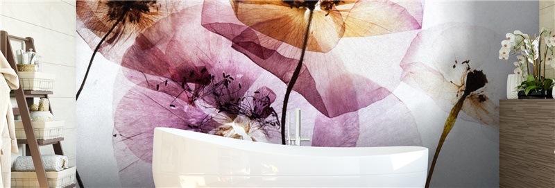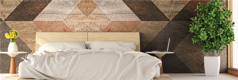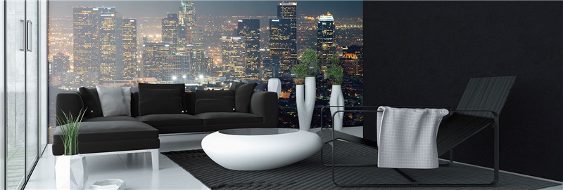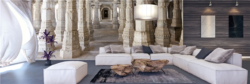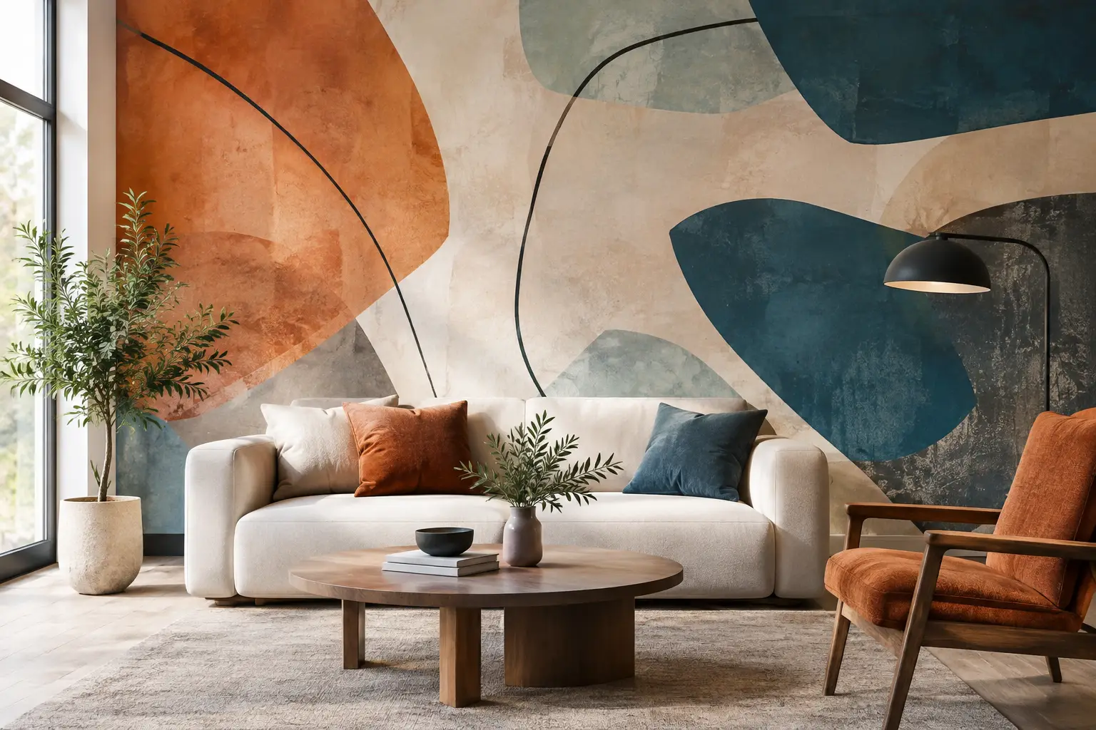
A blank wall behind a sofa or bed is rarely just a blank wall. It is often the largest uninterrupted surface in the room, which makes it the place where a design either gains personality or stays unfinished. Abstract mural wallpaper gives that surface a purpose without asking it to depict a literal scene. Color, movement, texture, and shape do the work, creating a feature wall that can feel calm, architectural, energetic, or quietly luxurious.
The appeal is not simply that abstract designs are eye-catching. They are flexible. A soft watercolor wash can make a bedroom feel more restful, while graphic geometry can give a home office focus. For a living room, layered brushstrokes or stone-inspired forms can connect existing furniture, textiles, and accent colors into one considered composition.
Why Abstract Mural Wallpaper Works So Well
Unlike a repeating wallpaper pattern, a mural is designed to be read as one complete image across the wall. That larger scale gives abstract art room to breathe. A painted curve can travel behind a sectional, a field of tonal color can frame a dining table, and a broad architectural shape can visually organize a room with high ceilings or an open layout.
This also makes abstract imagery a useful choice when you want visual interest without committing to a specific subject. A tropical landscape, cityscape, or floral mural establishes a clear theme. An abstract wall mural leaves more room for your own furnishings and collections to lead the story. It can support a mid-century chair, contemporary lighting, vintage wood pieces, or minimalist décor without competing with them.
There is a trade-off. Because the image is large and expressive, it needs to be selected in relation to the room rather than from a small product thumbnail alone. A design that looks subtle on a screen may have strong contrast once printed at wall scale. Conversely, a bold-looking composition may become exactly the grounding element a sparsely furnished room needs.
Start With the Room's Job, Not a Trend
Before choosing colors or patterns, consider what the room needs to do. A bedroom usually benefits from a mural that feels settling from the bed, particularly if the wall sits behind the headboard. Misty gradients, muted botanical abstractions, plaster-like textures, and flowing lines tend to create a softer backdrop.
In a living room or dining area, the mural can carry more visual weight. Deep mineral tones, expressive painted marks, oversized arches, and balanced geometric compositions can hold their own against larger furniture. In a home office, look for movement that feels organized rather than distracting. Linear forms, tonal maps, and restrained color blocking can provide energy without making video calls or focused work feel busy.
Commercial spaces call for the same discipline. A reception area may benefit from a confident, brand-aligned color field, while a wellness setting often needs lower contrast and gentler transitions. For hospitality and retail projects, the mural should photograph well while still feeling appropriate at close range. Scale, lighting, and viewing distance all matter.
Choose a Palette That Belongs in the Space
Pull two or three colors already present in the room, such as the upholstery, area rug, cabinetry, wood tone, or window treatment. The mural does not need to match these colors exactly. It should relate to them. A navy sofa can sit beautifully against a mural with softened blue-gray, warm sand, and rust accents. Cream walls and oak furniture may call for a design with clay, charcoal, and faded green.
If the room has limited natural light, avoid assuming that a pale mural is the only safe option. Darker abstract mural wallpaper can add depth and make a room feel intentionally enveloping. The key is contrast. When the mural is dark, introduce lighter upholstery, lampshades, art, or trim so the wall reads as dimensional rather than flat.
For open-concept spaces, use the mural to establish a zone. An abstract composition behind a dining table can create a sense of destination without adding a physical divider. Choose a palette that echoes nearby finishes so the transition still feels natural.
Let the Design's Scale Match the Wall
Scale is where many mural decisions are won or lost. Large, open shapes generally suit wide walls because they remain legible from across the room. Fine, intricate detail often works best where viewers can stand closer, such as a hallway, office, powder room, or stair landing.
Consider what will cover the lower portion of the mural. A bed, credenza, sofa, or tall shelving unit can obscure meaningful details near the floor. Designs with a strong focal point near the center or upper third of the wall usually work better in these situations. For a full-height wall visible from multiple angles, a composition with movement from edge to edge can be especially effective.
A custom-sized mural avoids the awkward compromises that come from trying to make a standard-size design fit an unusual wall. Measure the full width and height of the intended area, then account for baseboards, crown molding, windows, doors, and permanent built-ins. For complex spaces, a simple wall sketch with measurements gives the production team a clearer starting point.
Material and Print Quality Matter as Much as Artwork
A mural is only as convincing as its print and finish. Fine tonal variation is central to many abstract designs, especially watercolor effects, cloudy gradients, painted plaster textures, and layered neutral compositions. Poor printing can turn those transitions into visible banding or make subtle color shifts look dull.
Professionally printed mural wallpaper on adhesive vinyl film is designed to give a crisp, continuous result while simplifying application on properly prepared painted drywall. Durable latex inks provide rich color, and an anti-scratch finish helps the completed surface stand up to normal daily use. Those practical details matter in high-traffic rooms, family spaces, offices, and commercial interiors where the wall is part of the environment, not just a backdrop for a photograph.
Wall preparation is equally important. The surface should be clean, smooth, dry, and fully cured if it has been recently painted. Texture, dust, loose paint, moisture issues, and fresh paint can affect adhesion and the finished appearance. If you are a renter, check your lease and wall condition before ordering. Adhesive wall coverings are not a substitute for permission or for repairing damaged drywall.
Panel construction also deserves attention. Large murals are supplied in manageable sections, and careful alignment is what keeps lines, curves, and shapes flowing naturally from one panel to the next. A design with broad color fields can be forgiving, but precise geometric artwork makes accurate installation especially important.
Custom Artwork Can Create a More Personal Wall
Catalog designs offer a strong starting point, but abstract murals are also an excellent format for custom artwork. A scan of an original painting, a digital illustration, a studio-made texture, or a personal photograph that has been artistically edited can become a room-scale statement.
The deciding factor is image quality. A file that looks sharp on a phone may not contain enough detail for a large wall. Resolution, original image dimensions, crop, lighting, and compression all affect the final print. This is why design review is valuable before production, particularly for oversized installations or artwork that includes fine lines and subtle gradients.
At Murale Design, customers can receive help evaluating an image and choosing an appropriate crop or mural layout before it is printed. That guidance is useful when the goal is not merely to fill a wall, but to preserve the character of the original artwork at the size the room requires.
Make the Mural Feel Finished After Installation
Once the wall is installed, resist the urge to cover every inch of it. Abstract mural wallpaper is often strongest when the furniture arrangement leaves enough of the composition visible. Keep tall accessories and crowded gallery walls to a minimum unless they are part of a deliberate layered look.
Repeat one accent color from the mural in a pillow, throw, ceramic piece, or area rug, then stop there. The room should feel connected, not color-coded. Lighting can reinforce the effect as well: warm lamps enhance earthy and painterly designs, while clean directional lighting can emphasize geometry and texture.
The right abstract mural does not need to explain itself. It simply gives the room a visual center, makes ordinary walls feel considered, and leaves space for the life that happens in front of them.
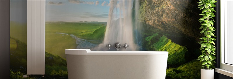
![Best Bathroom Mural Ideas to Elevate the Room [even for small bathroom]](/assets/documents/article/image/sans-titre.jpg)